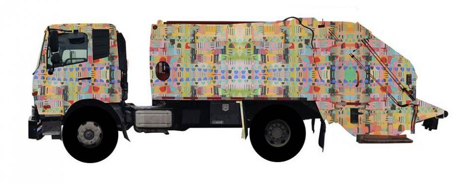
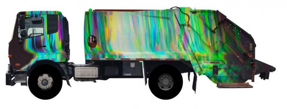
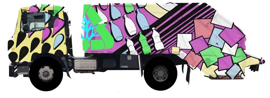
Designed to Recycle, a public art project collaboration between the DC Commission on the Arts and Humanities and the DC Department of Public Works, was developed to create mobile canvases featuring the work of local artists to highlight the importance of recycling.
Spring and Summer of 2015
Colors in the Night by Kellie Cox
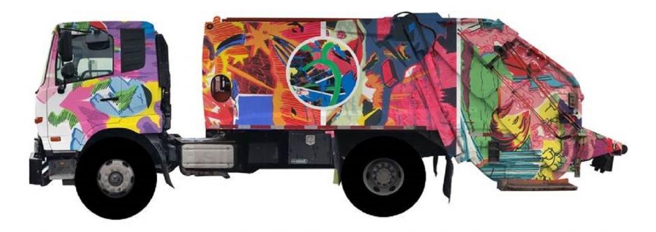
The Cap City Cruncher by John Deardourff
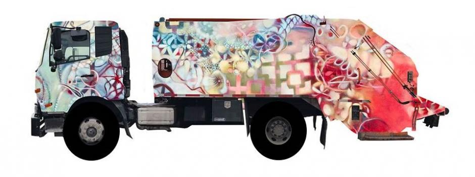
Tale of Three by Patricia Goslee
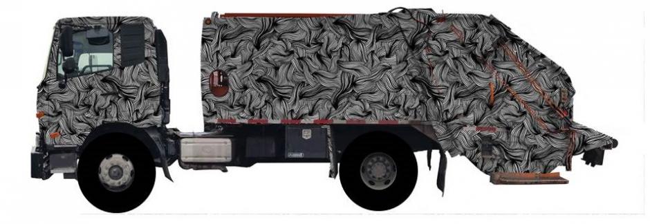
The 'Cycle of Life by Carolyn Sewell
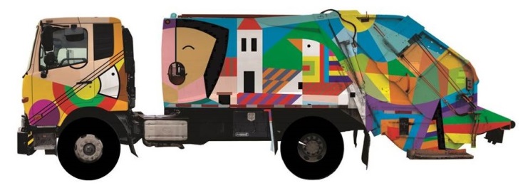
Nuestra Tierra by Nicolas F. Shi
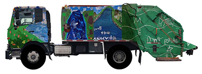
Save the Anacostia by Young Artists of ArtReach at THEARC
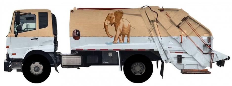
Consilius’ Four Questions by Kirk Waldroff
Spring and Summer of 2018
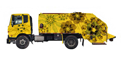
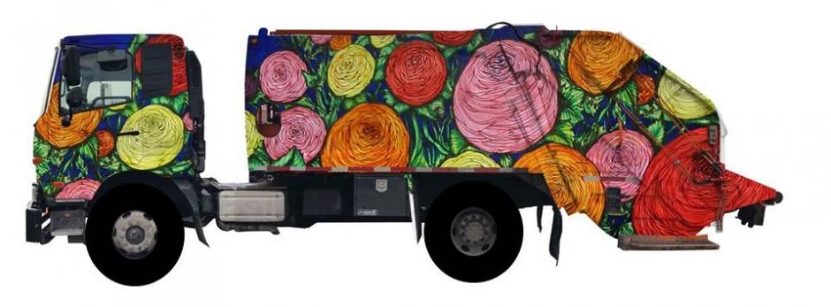
Recycled Flowers by Jon Gann
Original Medium: Digital art
About the Work:
The ultimate renewal of trash is to bloom again as flowers and plants. I have created muted "flowers" from crushed cans, crumpled bottles, wadded paper, and glass bottles, which cascade along the sides of the truck, contrasting against a bold marigold background. The simple design evokes classic fabric patterns, with a very modern touch.
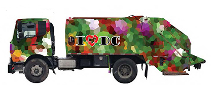
I “recycle” DC by Nicolas Shi
Original Medium: Digital art
About the Work:
As a long-time resident of Washington, DC (32 years and counting), I love this city. I love its monumental architecture, the Victorian townhouses strewn all over the city, and the explosion of colors throughout the seasons. I also realize that recycling is a big part of caring for the environment and being green. For “Designed to Recycle” I started by creating an abstract image of a picture from my garden to which I added the ubiquitous I “heart” DC, switching the heart for a recycling logo. In the process, the heart was transformed into a three-arrow heart insinuating the love for recycling to keep DC green.
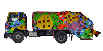
Mapping by Santiago Flores-Charneco
Original Medium: Acrylic on assembled canvas
About the Work:
Although my paintings may be considered entirely ‘abstract’, that is, non-mimetic, they reflect some of the complexity of form by which realistic works of art depict the wealth of human experience. For instance, they show the familiar imagery of city maps and the architectural plans of the urban complex, with its patterns of change, gentrification, and transmutation, which in turn, generate a multiplicity of planes of different depths, textural variables, and tonal contrasts. This conceptual exploration of paintings as welded surfaces of fragments of other paintings speak strongly to issues of identity, popular culture, recycling, and the renovation of a fragmented cultural world.
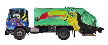
Urban Jungle by Jackie Coleman
Original Medium: Mixed media
About the Work:
I created "Urban Jungle" to highlight the importance of recycling as a way to protect and preserve wildlife and wildlife habitats. The resulting truck design is bright, whimsical, inviting, and conveys a positive theme. It draws attention to the value of recycling and seeks to spark a healthy dialogue about conservation, especially among and with younger children.
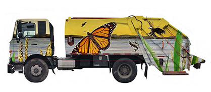
Nurturing Nature by Kofi Tyus
Original Medium: Watercolor and mixed media
About the Work:
The inspiration for my work was a boat trip on the Anacostia River that showed the power and vulnerability of this natural waterway. The natural beauty of the river and the habitat it provides for so many simple, but amazing, creatures inspired me to produce this piece. I have begun working in watercolor again and it provides a brilliant medium for representing the lush color and, at the same time, the fragile ecosystem that must be protected.
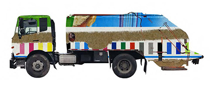
Untitled by Dean Kessmann
Original Medium: Digital art
About the Work:
What remains consistent throughout my practice is an intense interest in the relationships between abstraction and representation, physical objects and digital information, compression and expansion. Each new project builds upon and expands my larger body of work, while at the same time folding into it. My ongoing goal as an artist is to create fresh iterations that fuse the lessons learned with happenstance that is part and parcel of the creative process. The intuitive impulse in my practice is balanced with a more critical and reasoned approach. If one looks closely at the subtle twists and turns that have led me from one project to the next, it should be apparent that my meandering is with purpose. I strive to create work that is intellectually engaging and visually striking, open to multiple interpretations without being overly ambiguous, smart, and challenging without becoming pretentious or abstruse. While my choice of media is, at times, made for practical purposes, these decisions are, more often than not, arrived at for very specific conceptual reasons: a recognition and appreciation of the fact that materials have meaning.
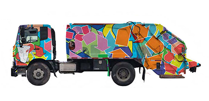
Evolution with an ‘R’ by Gordon Steve Spencer Davis II
Original Medium: Mixed media
About the Work:
This piece seeks to depict the simple, yet powerful, experience of self-discipline and the impressive benefits of individual action in our environment. The arrangement of characters is an allusion to the iconic chronological "evolution of man" illustrations. The intention in relating the ideas of recycling and evolving is to recommend, and/or suggest, to the viewer that, like the characters, we should consider our surroundings and be an agent of development, cleanliness, and overall personal responsibility.
The name of this artwork is, "Evolution with an 'R' (Revolution)". The reason I named it "...(Revolution)" is to celebrate the difference one person can make through their actions; within themselves, their community, and the entire world. Much like the act of evolving, recycling is an overwhelmingly impactful concept that begins with the smaller, individualized actions (i.e; picking up trash or throwing plastic into recycling), but has drastic effects on the larger population of life on Earth through consistency and diligence.
The background collage of recycling emblems is a symbol representing the responsibility and actions of the "many" necessary to make the environmental change we all seek. This very busy, colorful, and interwoven net of emblems in juxtaposition to the "evolution" of one character is to further impress that to make an individual effort is to make a difference; and is typically a quite simple thing to accomplish.
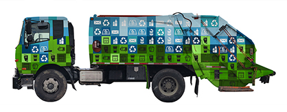
Inform, Reduce, Recycle by Minsoo Kang and Andre Sanchez-Montoya
Original Medium: Digital art
About the Work:
Relying on minimal aesthetics with color and symbol association we hope to raise awareness about what can be sorted and recycled into Washington, DC’s blue recycling containers and what items residents can place in the city’s green waste containers.
We’ve placed two sets of symbols around the truck on two different color gradients. The icons layered on the blue squares are representative of the materials that DPW can process and recycle: plastic, glass, paper, and metal. The second set is layered over green squares and represents popular consumer goods that are waste items and cannot be recycled: to-go coffee cups, used takeout containers, and electrical waste.
The style of logos incorporated into the vinyl cut design is inspired by the sustainability cultures of other cities and countries that have strong visual communication that accompanies their municipal waste collection system. We want this design to be used to inform Washington, D.C residents and workers about what they buy and how to dispose of it, whether it's in the house or on the job.
With this design, these recycling vehicles are transformed into colorful and educational infographics that residents will see in their alleyways, on their street corners, and against the brick and concrete cityscape.
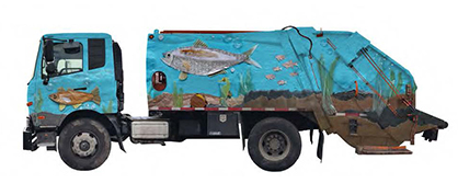
Recycled Fish by Carly Rounds
Original Medium: Mixed media
About the Work:
Design and illustration work best when they can delight and inform, and that was the intention behind these playful "Recycled Fish". Handcrafted from items found in my recycling bin, the American Shad — DC's state fish — is front and center, surrounded by other Potomac river wildlife: a walleye, a clam, a seahorse, and some sunfish. This design is a fun and captivating way to engage residents in thinking about our local environment and the effects of human consumption and waste management in our beautiful city. The materials we interact with every day shape our behavior and environment, yet we are often too far removed from the consequences. My intention with this design is to elicit a "smile in the mind" when the viewer realizes the fish are created from the very items the truck contains and to invite them to think further about the impact of recycling.
As a resident of DC for the past 17 years, I have explored this city through the artist's eyes and celebrated both its natural and man-made beauty. Raising my two young children here has reignited my passion for creating positive change in our local environment. I am grateful for the opportunity to submit this piece for consideration and thank you for your time.
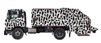
Zero Hero by Anne Masters
Original Medium: Digital art
About the Work:
The idea of covering a recycling truck with a graphic pattern of recyclable objects serves not only as a daily reminder of all things recyclable but also as an infographic or data visualization, promoting our collective participation as an aware and environmentally friendly community. The stark contrast of a black and white design in a cheerful, bold, and pleasing pattern will stand out in any neighborhood landscape and the shapes and objects are playful yet informative.
Most of my friends and acquaintances consider themselves to be environmentally friendly. They think they recycle. But I’ve observed many of them buying endless cases of bottled water, toss packaging, and other detritus in the trash without a second thought. There’s a learning curve to recycling… and if my design can help with that, then I’ll consider it successful.
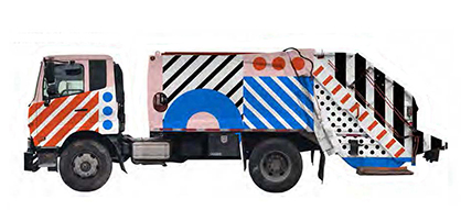
Pop District by Blue Pretzel
Original Medium: Digital art
About the Work:
The sight of the city’s large recycle trucks should bring joy and encourage conversation. Featuring bright, fun artwork our truck wants to excite citizens as they see it drive-thru their neighborhood. The color and patterns chosen are reminiscent of childhood, where we all first learned about recycling, however, they are still clean and modern showing how far the recycling movement has come in recent years.
The success of recycling depends on the cities dedication to resources and its citizens' willingness to participate; so this truck is designed to be playful and push interaction through social sharing. This will bridge the gap between the city’s green initiatives, and the city’s love of public art.
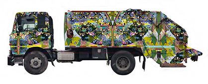
Untitled by Katherine Tzu-Lan Mann
Original Medium: Mixed media
About the Work:
My work's abstractions arise from the subjects I portray: ecological and geological cycles, processes of chemical corrosion, and natural efflorescence. With roots in traditions of Chinese landscape painting, my monumentally sized paintings and installations evolve a fantastic, abstract vision of the natural world. My latest work confronts the challenge: the resuscitation of landscape painting in a world where "landscape" is represented and defined through an ever-widening field of digital, graphic, and visual forms. How can a painting or design capture flux, abundance, waste, fertility, and the collision and collusion of diverse forms? How can it respond to the pressure we place on our era's fragile ecosystem? The designs I submitted for the Designed to Recycle grant cover recycling trucks in garlands of leaves, sustaining the tension between what is artificial and what is natural, between what is chemical and what is biological, between organic and inorganic. The trucks, therefore, acknowledge humanity’s place in an ever-shifting ecology, celebrating nature, landscape, and the world, in the broadest sense of the term, that sustains us.
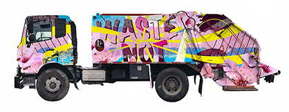
Waste Not by Nicole Hamam
Original Medium: Digital art
About the Work:
The inspiration for my Designed to Recycle piece is a juxtaposition between the vibrant pop art of the 1960s and retro signage of the same era. The goal was to create an eye-catching design that would be seen at a distance, so a palette of bold, foundational screenprinting colors—cyan, magenta, yellow, and black—were chosen. The concept also plays a bit with the dirt and grit that is connected to this industry with the chosen colors and large, soft cherry blossoms.
The large messaging of WASTE NOT pushes the awareness of recycling as it is surrounded by aesthetic images of the Washington DC community and neighborhoods. A design without the words was also submitted.
The piece was designed with the structure of the truck in mind, using the large, flat areas for the main message and recognizable community elements. The normal cleanliness and wear and tear of the vehicle were also one of the main design considerations. This design will hold up well—hiding dirt and scruffs—for the two-year lifespan.
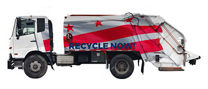
Recycle Now! by Michael Marshall Design
Original Medium: Digital art
About the Work:
This design celebrates DC symbolism and uses a commercial feel to make a bold statement and impression. This simple, minimalistic design uses the flag, which appears to be draped over the truck, to inspire civic pride. The dynamic message: “Recycle Now!” urges residents and visitors to engage in recycling with an underlying message that it will directly impact the city they live in, work in, visit and love.
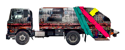
Fair Card Value by Michael Crossett
Original Medium: Digital art
About the Work:
I grew up in a military family with life always in motion. Living abroad gave me a fascination with urban life, different cultures, and contemporary design. Throughout my life, I photographed things that stood out from their surroundings and found a love for the magic of development. Today, my process includes digital photography and screen printing to capture and create the aesthetic that defines city life. As a mixed media artist, I see myself as an architect making new structures and compositions with elements of the past, familiar places, and everyday life marked with the passage of time and the force of change. My layered compositions juxtapose photography and historic imagery with relevant symbols and icons.


